[vc_row layout=”normal” margintop=”0″ marginbottom=”15″ paddingtop=”0″ paddingbottom=”0″ bg_color=”#ffffff” bg_repeat=”repeat” bg_stretch=”no” en_border=”no” border_color=”#e8e8e8″][vc_column width=”1/1″][vc_column_text]
It has been a while I have not written article on GIS and map production. Today I thought, I should write checklist while designing maps. Maps are very important tool to convey message and they should be well organized . What that means to me is, when you see the map you should grab the core theme of it. Geographic Information System has become important part in our life and they helps us to create pretty, beautiful and awesome maps. For this task I am using Arcgis 10.3 software.
Map design is a time consuming process, so think before you draw. You are telling a story through maps. Next thing you should consider is the look and feel of the map, whether it is historical, modern or technical and last point is the purpose of the map. You should use enough text, charts and other image to provide information to the viewer.
[/vc_column_text][vc_separator style=”double” padding_top=”30″ padding_bottom=”30″][/vc_column][/vc_row][vc_row layout=”normal” margintop=”0″ marginbottom=”15″ paddingtop=”0″ paddingbottom=”0″ bg_color=”#ffffff” bg_repeat=”repeat” bg_stretch=”no” en_border=”no” border_color=”#e8e8e8″][vc_column width=”1/1″][vc_column_text]1. Before designing the layout, you should setup the printer properties. If you are printing the map from Arcgis software then make sure check the “Use Printer Paper Settings”.
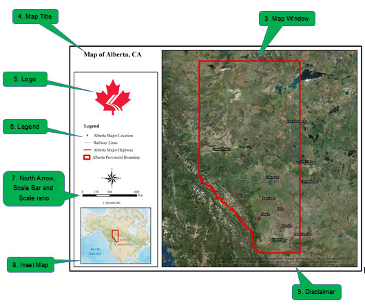
 [/vc_column_text][vc_separator style=”double” padding_top=”30″ padding_bottom=”30″][/vc_column][/vc_row][vc_row layout=”normal” margintop=”0″ marginbottom=”15″ paddingtop=”0″ paddingbottom=”0″ bg_color=”#ffffff” bg_repeat=”repeat” bg_stretch=”no” en_border=”no” border_color=”#e8e8e8″][vc_column width=”1/1″][vc_column_text]2. First create the Layout that will contain your map, legend, title and other texts. I have included few sample of map layout design. The good thing about the ArcGIS software is you can save the template for future and can import later for other projects.

You can also download this infographic in PDF versions.
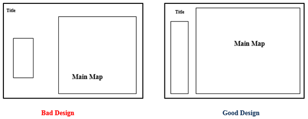
A good layout design should have balanced margins, white space, bounding box and alignments. See below image which shows both the bad and good design.
 [/vc_column_text][vc_separator style=”double” padding_top=”30″ padding_bottom=”30″][/vc_column][/vc_row][vc_row layout=”normal” margintop=”0″ marginbottom=”15″ paddingtop=”0″ paddingbottom=”0″ bg_color=”#ffffff” bg_repeat=”repeat” bg_stretch=”no” en_border=”no” border_color=”#e8e8e8″][vc_column width=”1/1″][vc_column_text]3. After designing the layout it is time for you to add gis layers on the map window. Fix the scale and the Dataframe boundary. Scale is dependent upon your requirement, how much area you want to show, and also the size of the main window. It is a good practice to have thicker boundary line compared to other lines. Use the “guide and scale bar” on the Arcgis layout to design the perfect layout.
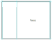
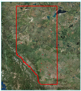
Fig: Layout Design and Map Window[/vc_column_text][vc_separator style=”double” padding_top=”30″ padding_bottom=”30″][/vc_column][/vc_row][vc_row layout=”normal” margintop=”0″ marginbottom=”15″ paddingtop=”0″ paddingbottom=”0″ bg_color=”#ffffff” bg_repeat=”repeat” bg_stretch=”no” en_border=”no” border_color=”#e8e8e8″][vc_column width=”1/1″][vc_column_text]4. Then add the title of the map and it’s font size must be bigger than other font size on the map. This makes your map title stand out.
![]() [/vc_column_text][vc_separator style=”double” padding_top=”30″ padding_bottom=”30″][/vc_column][/vc_row][vc_row layout=”normal” margintop=”0″ marginbottom=”15″ paddingtop=”0″ paddingbottom=”0″ bg_color=”#ffffff” bg_repeat=”repeat” bg_stretch=”no” en_border=”no” border_color=”#e8e8e8″][vc_column width=”1/1″][vc_column_text]5. Now you insert your company logo at the top or at the appropriate location. The logo size must be bigger than the map title. Use the “align center” tool from the graphics toolbar to align the map title and the logo.
[/vc_column_text][vc_separator style=”double” padding_top=”30″ padding_bottom=”30″][/vc_column][/vc_row][vc_row layout=”normal” margintop=”0″ marginbottom=”15″ paddingtop=”0″ paddingbottom=”0″ bg_color=”#ffffff” bg_repeat=”repeat” bg_stretch=”no” en_border=”no” border_color=”#e8e8e8″][vc_column width=”1/1″][vc_column_text]5. Now you insert your company logo at the top or at the appropriate location. The logo size must be bigger than the map title. Use the “align center” tool from the graphics toolbar to align the map title and the logo.
![]() [/vc_column_text][vc_separator style=”double” padding_top=”30″ padding_bottom=”30″][/vc_column][/vc_row][vc_row layout=”normal” margintop=”0″ marginbottom=”15″ paddingtop=”0″ paddingbottom=”0″ bg_color=”#ffffff” bg_repeat=”repeat” bg_stretch=”no” en_border=”no” border_color=”#e8e8e8″][vc_column width=”1/1″][vc_column_text]
[/vc_column_text][vc_separator style=”double” padding_top=”30″ padding_bottom=”30″][/vc_column][/vc_row][vc_row layout=”normal” margintop=”0″ marginbottom=”15″ paddingtop=”0″ paddingbottom=”0″ bg_color=”#ffffff” bg_repeat=”repeat” bg_stretch=”no” en_border=”no” border_color=”#e8e8e8″][vc_column width=”1/1″][vc_column_text]
6. Next part is the legend and use your common sense to use single column or the multiple column. It all depends on the number of layers you want to show on the legend. Fix the width and height of the legend which depends on the size of the layout. As I am using 8.1/2 by 11, I am using width 15 and height 10. Legend font size should be big but smaller than the map title. I have used the legend font size twice big then layer names on the legend. Layers name font size must be bigger than the font size of the disclaimer text. There should be enough gap between the word legend and layer names in the legend. If your legend has columns then there should be enough gap between columns. Arcgis has give you all the option to assign the gap between columns and layers, see below image.

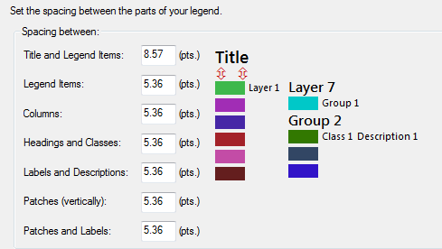
Figure: ArcGis Legend Spacing Editor Window.[/vc_column_text][vc_separator style=”double” padding_top=”30″ padding_bottom=”30″][/vc_column][/vc_row][vc_row layout=”normal” margintop=”0″ marginbottom=”15″ paddingtop=”0″ paddingbottom=”0″ bg_color=”#ffffff” bg_repeat=”repeat” bg_stretch=”no” en_border=”no” border_color=”#e8e8e8″][vc_column width=”1/1″][vc_column_text]
7. After the legend is added, you can add north arrow, scale bar and scale ratio. These three items are necessary for any basic maps. ArcGIS software provides number of north arrow style, pick the one that match with your layout and map window theme. Scale bar and scale ratio are pretty straight forward. For the scale bar choose the appropriate unit, if you are doing large scale map then preferably meter will be fine, if not Kilometer. If you are designing the map for USA region then use miles as an unit. Font size of scale bar must be bigger than the scale ratio.

[/vc_column_text][vc_separator style=”double” padding_top=”30″ padding_bottom=”30″][/vc_column][/vc_row][vc_row layout=”normal” margintop=”0″ marginbottom=”15″ paddingtop=”0″ paddingbottom=”0″ bg_color=”#ffffff” bg_repeat=”repeat” bg_stretch=”no” en_border=”no” border_color=”#e8e8e8″][vc_column width=”1/1″][vc_column_text]
8. Inset Map is the next frame to go in your layout. If you do not know inset map, it is the small window to show the location of features in the main window in the larger area map. For example if you are creating Washington state map then in the inset map you will have USA map with the red dot showing the location of the Washington State. Inset map space should not take a big space on the whole layout window. Normally Inset Map space should be bigger than logo which makes it visible among all extra features that goes with the map.

[/vc_column_text][vc_separator style=”double” padding_top=”30″ padding_bottom=”30″][/vc_column][/vc_row][vc_row layout=”normal” margintop=”0″ marginbottom=”15″ paddingtop=”0″ paddingbottom=”0″ bg_color=”#ffffff” bg_repeat=”repeat” bg_stretch=”no” en_border=”no” border_color=”#e8e8e8″][vc_column width=”1/1″][vc_column_text]
9. At the bottom of the map window you can write disclaimer which will be the smallest font size and italic.
[/vc_column_text][vc_separator style=”double” padding_top=”30″ padding_bottom=”30″][/vc_column][/vc_row][vc_row layout=”normal” margintop=”0″ marginbottom=”15″ paddingtop=”0″ paddingbottom=”0″ bg_color=”#ffffff” bg_repeat=”repeat” bg_stretch=”no” en_border=”no” border_color=”#e8e8e8″][vc_column width=”1/1″][vc_column_text]
10. Final step after all above process is to export the map. You can save the map in any format you like, normally pdf version is the appropriate but depends on your need. You will save on PNG format if use transparency. Map on the JPEG version is the most popular.
[/vc_column_text][vc_separator style=”double” padding_top=”30″ padding_bottom=”30″][/vc_column][/vc_row][vc_row layout=”normal” margintop=”0″ marginbottom=”15″ paddingtop=”0″ paddingbottom=”0″ bg_color=”#ffffff” bg_repeat=”repeat” bg_stretch=”no” en_border=”no” border_color=”#e8e8e8″][vc_column width=”1/1″][vc_column_text]Final Output:
 [/vc_column_text][vc_separator style=”double” padding_top=”30″ padding_bottom=”30″][/vc_column][/vc_row][vc_row layout=”normal” margintop=”0″ marginbottom=”15″ paddingtop=”0″ paddingbottom=”0″ bg_color=”#ffffff” bg_repeat=”repeat” bg_stretch=”no” en_border=”no” border_color=”#e8e8e8″][vc_column width=”1/1″][tagline_box action_box_style=”style1″ call_text=”NOW READ:” call_text_small=”Tips and Tricks to Organize ArcGIS Table of Content (TOC)” title=”READ” target=”_self” color=”blue” size=”small” margin=”0″ href=”http://grindgis.com/blog/organize-arcgis-table-of-content-toc”][/vc_column][/vc_row]
