Numbers and figures tells the real story and they are logical. If those numbers are plotted on the map then graphical representation become obvious to the numbers. I have collected few world maps that will give you some knowledge, information and reality about the world. I have collected this maps from different sources. Statistics has become an important tool to understand or predict the values. It has been heavily used nowadays on the GIS field. Data are analyzed and are plotted on the map.
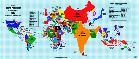
1. This map you would like to see which become quite popular in the social network. This map tells how the world will look like if it is scale based on the population. More detail on this map is presented on our blog.
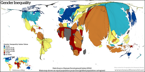
2.Global Gender Inequality: This map is based on the report from the United Nationals Development Programme (UNDP). This map is designed to present the loss of achievement within country affected by the gender inequality.
3.Female held in Prison: This map display the Female held in prison, rate per 100000 population. Map is taken from actualitix.com.

4.Happy Map: Denmark, Switzerland and Netherland are the happiest county in the world according to the U.N.-sponsored World Happiness Report by Columbia University’s Earth Institute. Map is taken from the Washington Post.

5.Unemployment Map: Map below is taken from the tumblr.com, which shows unemployment rate of different countries by percentage over the past 23 years, as well as projected unemployment rate for future.

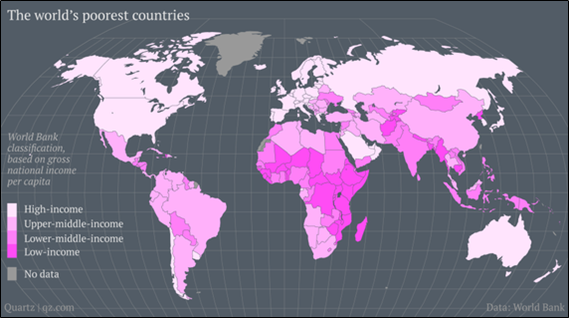
6.Poorest Countries: According to map presented by the theatlantic.com by 2035 there won’t be any poor countries left in the world, for now data presented by World Bank below shows the poor and rich income countries.
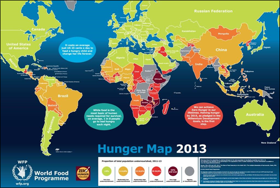
7.Hunger Map: Map is created by the World Food Programme, it is worth looking at this map. Detail about this map is here.
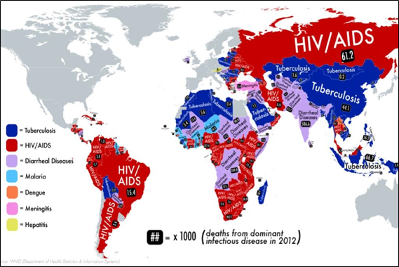
8.Infectious Disease Map: This map shows the deadliest disease by the Country. Map is taken from the global post.
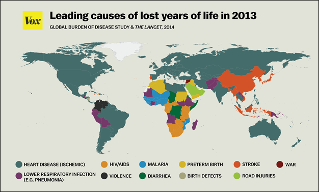
Map source: vox.com
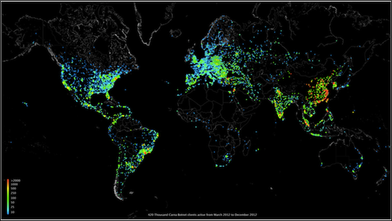
9.Web Usage: This map shows the use of web around the globe for year 2012, it is Map of the Internet Census 2012 botnet.
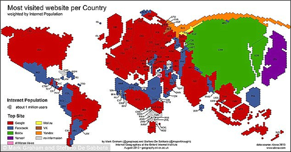
10.Most visited Website: This map shows the most used website around the globe. Map is taken from the dailymail.co.uk.
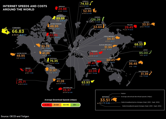
11.Internet Speed and Cost: Map shows graphical view displaying about the internet cost and speed around the globe. Map is taken from cira.ca.